Mockups & Recommendations
I provided a recommendations report and mockups of suggested design changes that would help combat the problems identified by the usability test and heuristic review.
After delivering the usability report and recommendations report, I presented my results and recommendations to a team of stakeholders. While many of the comments during my presentation amounted to “we suspected that” or “you’re not telling us anything we didn’t already know,” my research provided evidence to support their hypotheses. This support helped them secure budget and buy in to make the changes I recommended. They even hired me back on to help implement some of the changes.
Framework for Recommendations
Based on my conversations with stakeholders, they would be hard pressed to make any wholesale changes to the portal’s style guide or invest heavily in development. When making my recommendations, I made sure to use standard portal design elements in new and inventive ways that required minimal development time and could be quickly and easily implemented.
In the full recommendations report, I ranked my design recommendations based on severity to help the team prioritize. In my presentation to the group at the end of the project, I focused on the highest severity recommendations to drive home the importance of a redesign. I also included participant quotes and heuristics to support the recommendations and provide evidence.
Improving Navigation
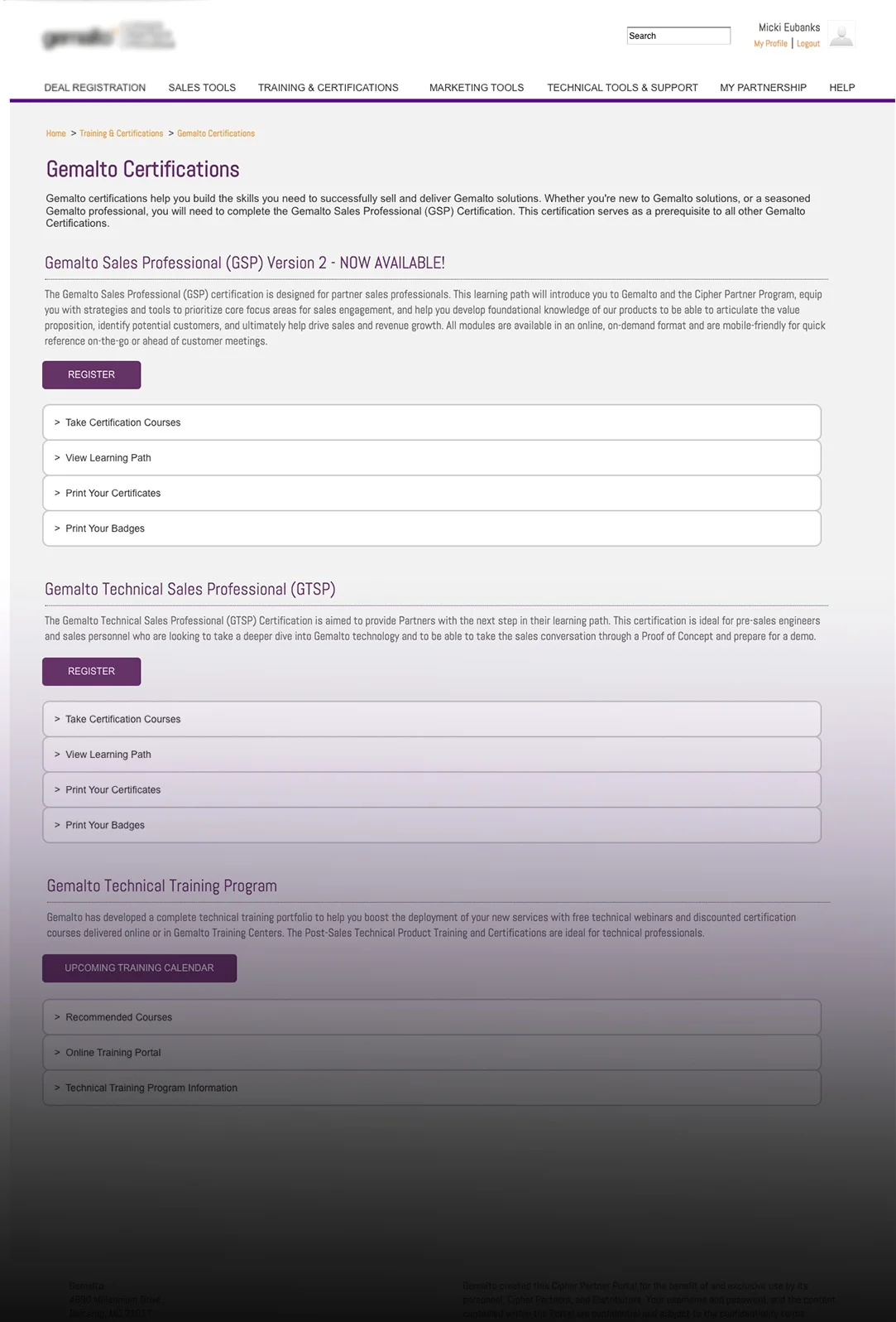
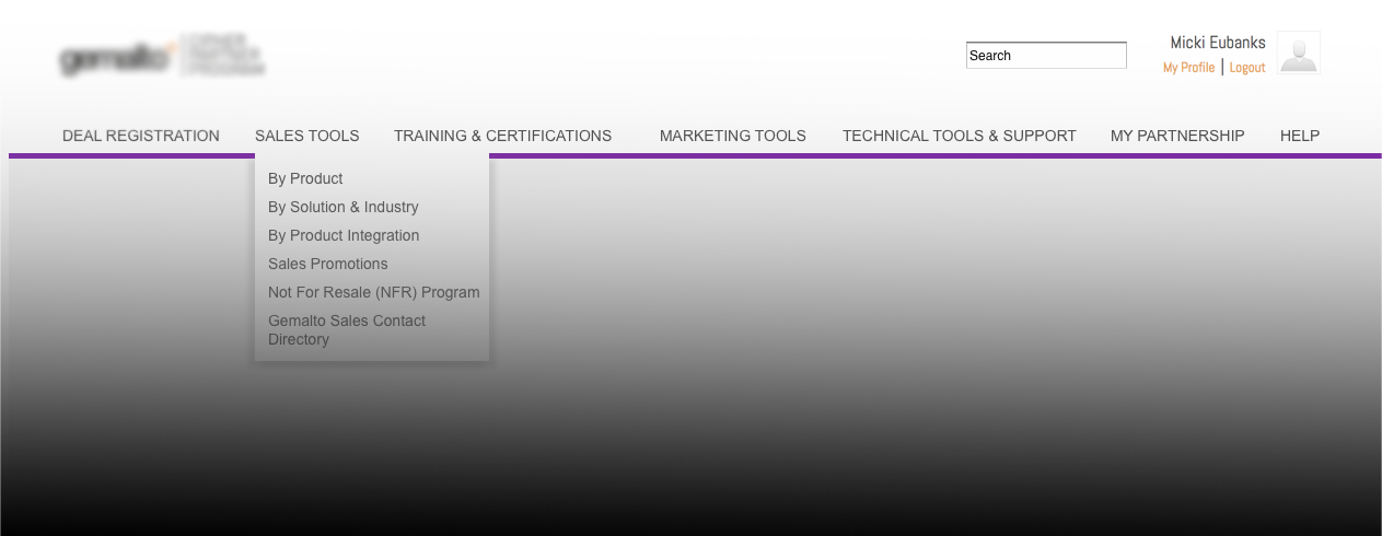
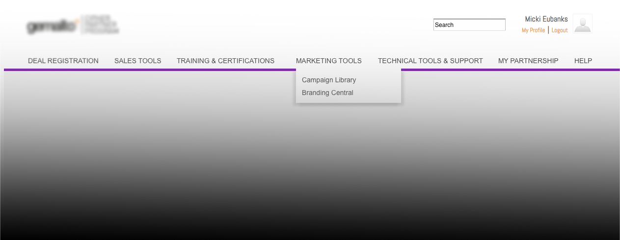
Based on feedback from participants, it was clear that the navigation could be more intuitive. I created mockups showing recommended changes that include navigation link name changes, combining multiple pages with similar content, and un-nesting tertiary navigation links.


User-centered Redesign
The homepage design was dictated by the partner marketing team, and is updated periodically to show new offers and incentive programs. Participants in the usability test said they didn’t use the Quick Links section because none of the links seemed useful. I took a user-centered approach to the design of the homepage, focusing on the Quick Links section and the carousel at the top of the page. To combat change blindness and the distraction of a moving carousel, I mocked up 4 smaller banners that are interactive only on mouse-over, therefore only when users want to interact with it. This gave the partner marketing team a more effective way to present new information to users. I also added descriptive information to the Quick Links section and changed the generic “visit page” links to reflect the action being taken upon click.
Combining Pages
As was pointed out by participants in the usability study, related information was spread across many pages. This turned the act of completing a task into a series of clicks and a search for the next logical step in the process. By containing related information to one page, users no longer had to search for the next step.
Reducing clicks
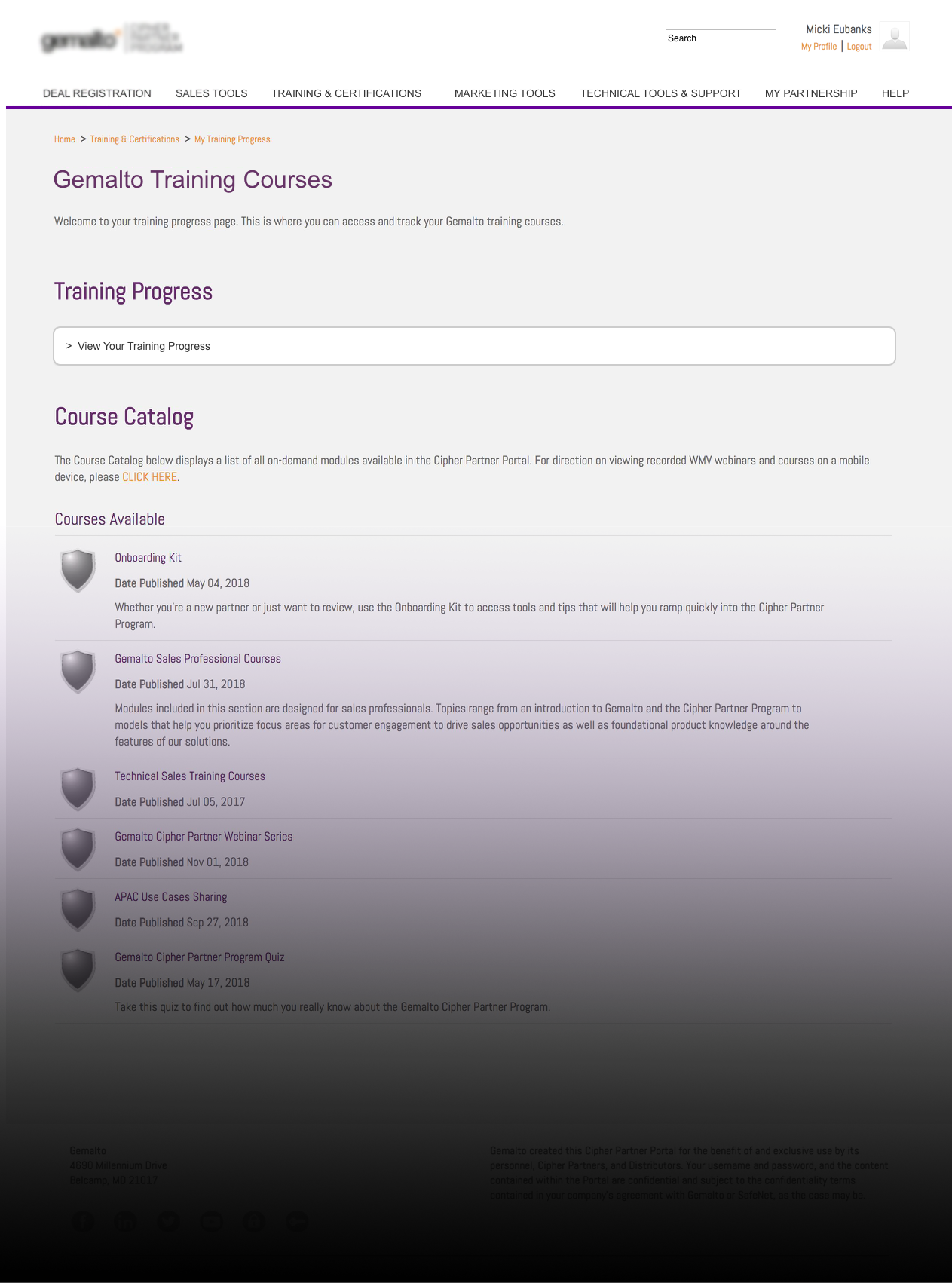
The portal listed sales tool by categories, which can make products easy to locate if you don’t know exactly what your customer needs because you can search based on industry or product type. During testing, I observed participants struggling to find a specific product, guessing which category it may be under and clicking through each category until they stumbled upon it. Instead of making users guess which industry or solution their desired product is listed under, I removed the extra click by exposing a list of products that is easy to scan.